Prism Tan
SCOPE: PACKAGING DESIGN
LOCATION: NEW YORK
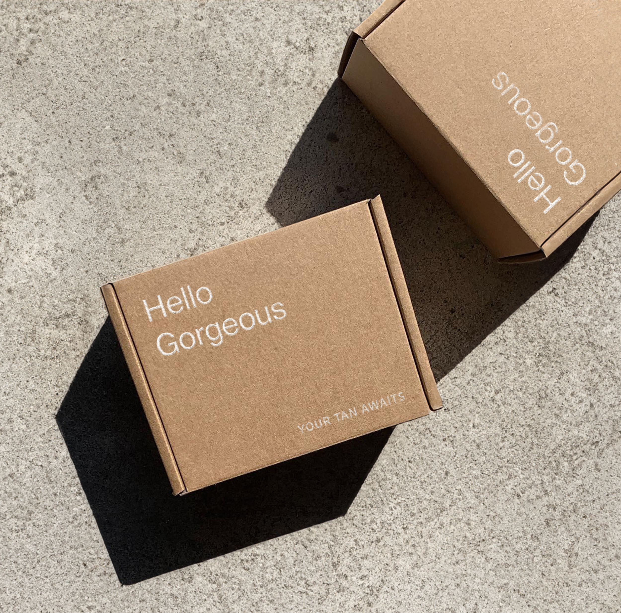
No streaks. No sun. No BS.
How do you make self-tan feel as cool as a designer handbag? That was the challenge. This wasn’t about another generic "glow-enhancing" bottle. It needed to feel premium but still rebellious, sleek but still fun.
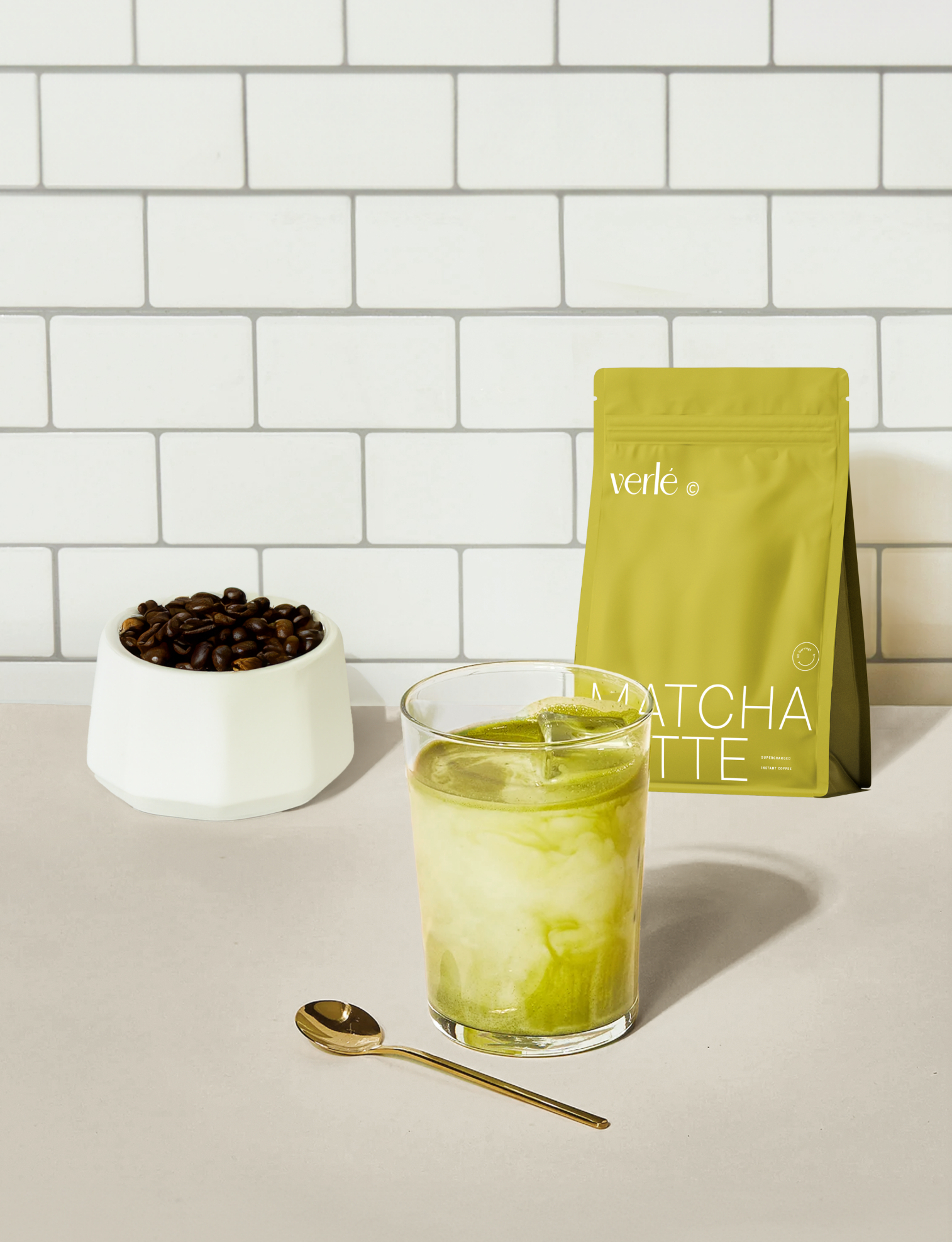
BRINGING THE VISION TO LIFE
We stripped away the fluff—no cliché bronze gradients, no beachy tropes. Instead, the design leans into minimalism with an attitude. A high-contrast aesthetic keeps it fresh and striking, while sharp typography and strategic negative space make it feel like a statement piece on any shelf. The branding is bold, effortless, and unapologetic—just like the people using it.

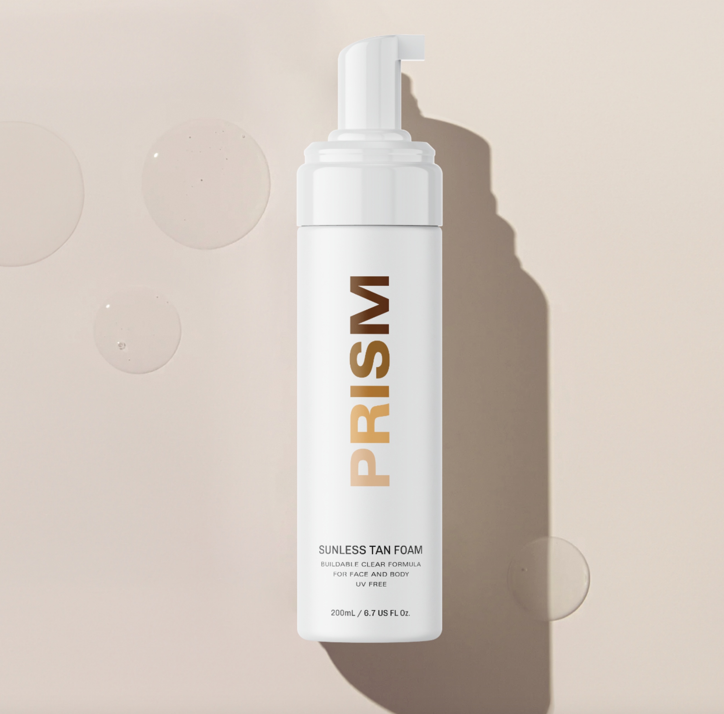

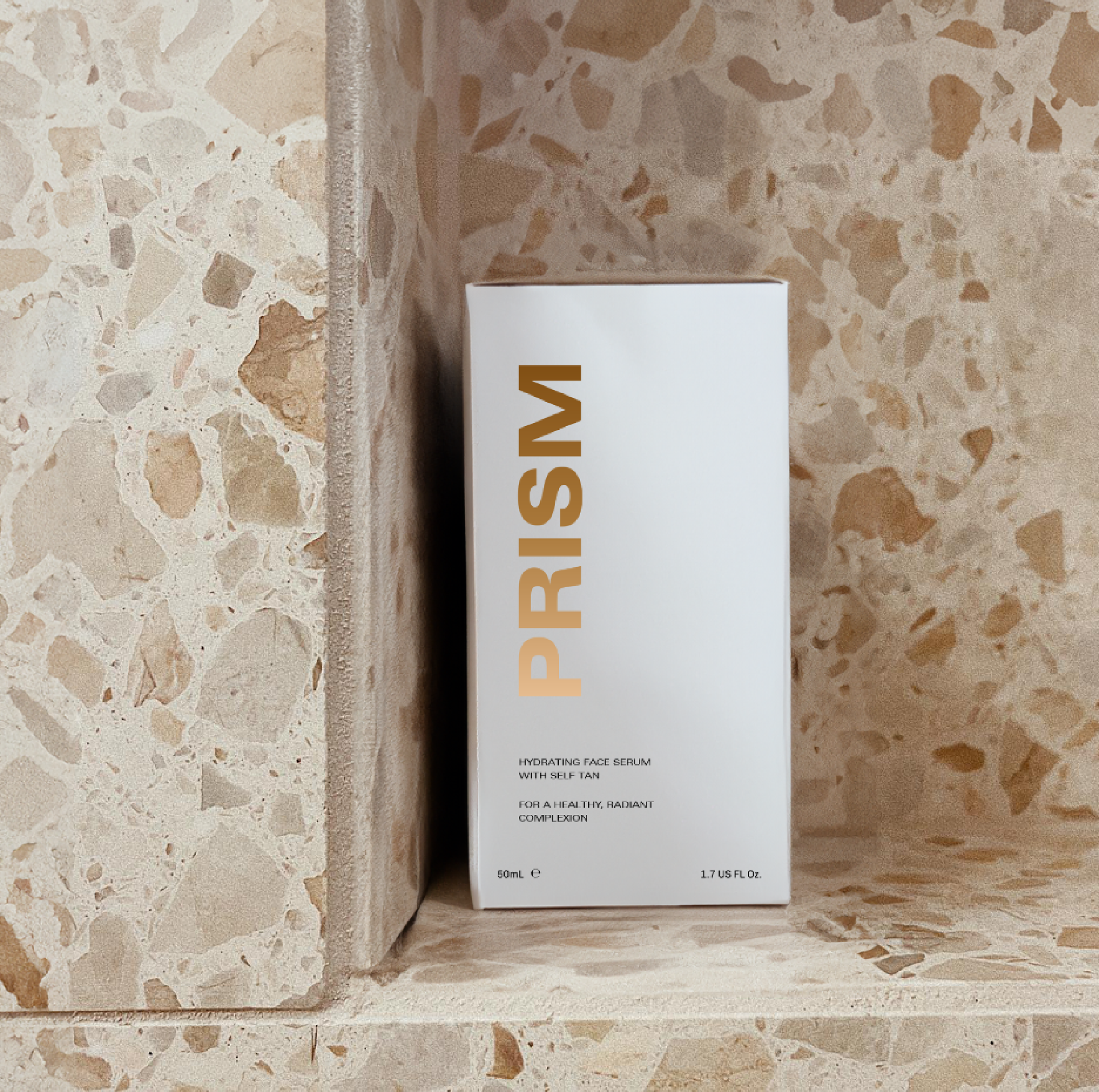
THE FINAL RESULT
A no-nonsense, high-impact packaging design that makes self-tan feel like a fashion accessory. Because glowing skin should be a flex, not a compromise.

Got a brand that deserves to be seen, craved, and obsessed over?
Need packaging that stops scrolls (and turns heads) or a campaign that gets people lining up at your door?
We bring the vision, strategy, and zhuzh to make it all click. Let’s build something iconic together. Hit us up, and let’s make magic.
GET A BTS LOOK AT SOME OF OUR FAVORITE PROJECTS

WANT US TO BRING YOUR BRAND TO LIFE TOO?